We Tried All 30 Marketo Starter Email Templates So You Don’t Have To – 2022
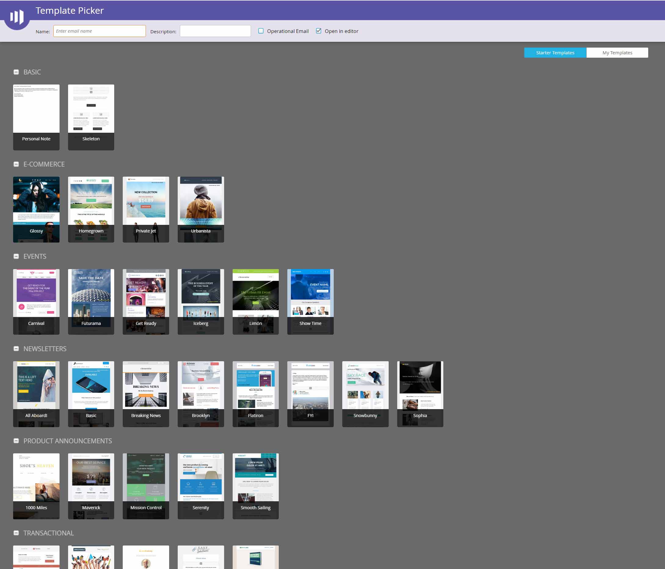
If you are a Marketo user, you’ve likely seen the above screen.
These Starter Email Templates are included with all Marketo subscriptions, but how do they measure up in terms of functionality, flexibility, aesthetic design, and render testing?
We took a few days to review all 30 Marketo Starter Email Templates so you don’t have to! See our honest impressions and feedback below.
As of the time this review was written, all 30 of these email templates were last updated 4/4/2017.
And make sure you read to the end to see our additional 3rd-party free email template recommendations.
A Quick Note on Modifying Starter Templates
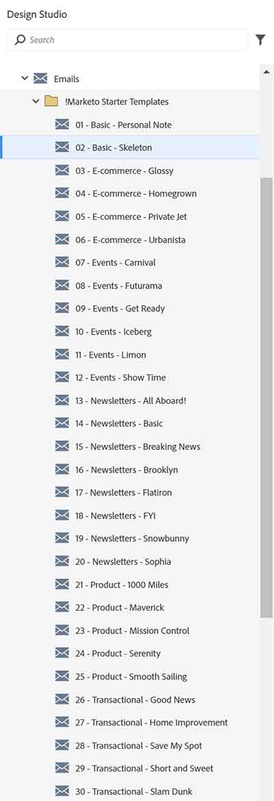
While “Starter Templates” are shown in the template picker screen, you won’t find the template asset in your left sidebar under Design Studio > Email Templates which means that you can’t update or edit the starter template HTML code. One workaround, however, is to create an email asset using a starter template… then click “Edit Code” and copy/paste the source code into a new email template that you can modify as needed.
As you’ll see in my reviews below, there are some critical things missing in many of these starter templates that impact their flexibility and re-usability. If you want to get serious about making these starter templates work for your org, I highly recommend that you use the above workaround to enable editing. You’ll also need a fair amount of custom email coding experience!
Our Review Process
1st – We created email drafts and tested editor features.
We also took special note of features like modules, global variables, local variables, and overall flexibility of the build.
Step 2 – Run thorough Litmus tests
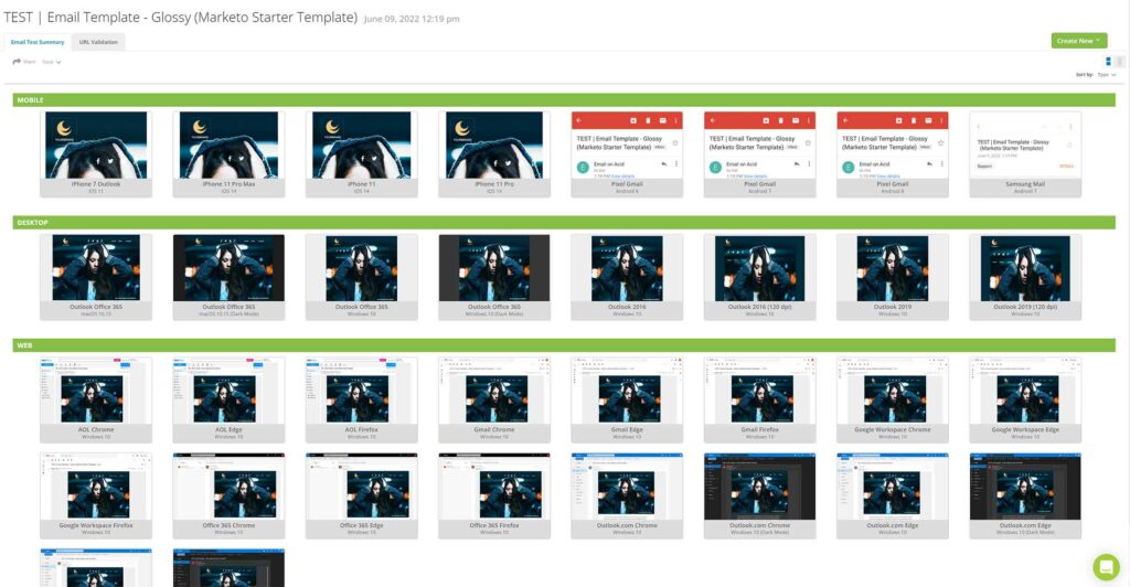
We paid attention to any potential issues with mobile, Outlook, etc, and documented them below.
And without further ado, here is our review of the 30 Marketo Starter email templates…
Let’s start with the good!
- All templates are built modularly which allows for easy cloning, deleting, or moving sections.
- Separate modules for dividers and spacers.
- Moderate use of local variables for backgrounds, padding, button style, etc.
Issues we found in virtually all 30 starter templates
- No global variables for font-family, font-color, and font-size. This means that if you want to change the fonts throughout your entire email, you’ll have to manually update the fonts within each editable text area. And for the buttons, you’re stuck with whatever font is used due to the way these templates were coded with limited variables.
- No ability to use webfonts.
- Logo image editable areas have sizing turned off. This will make it nearly impossible to size your 2x logos accurately. This might be the #1 deal-breaker for me. :(
- No toggles to hide individual components within modules such as subheads, buttons, and unneeded social icons.
TL;DR – Our top 6 picks from Marketo’s Starter Templates
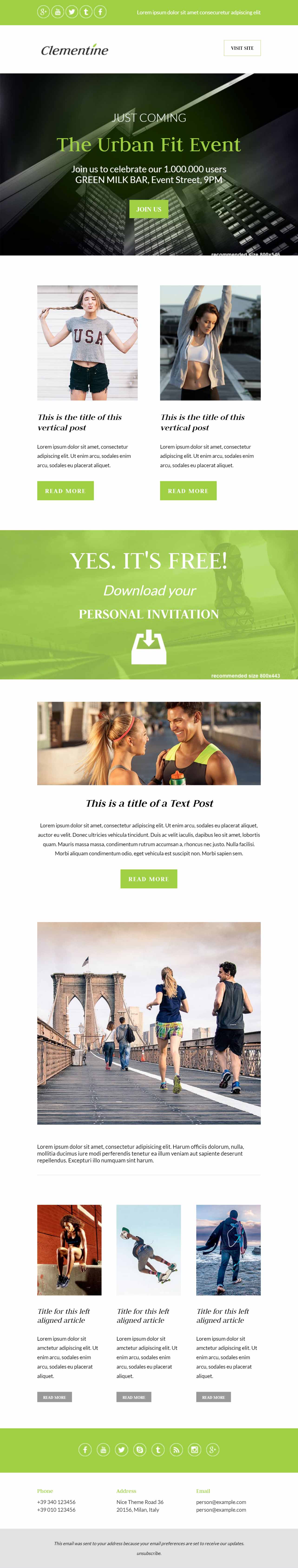
Save My Spot – Best plain and simple
Iceberg – Best for event emails
Limon – Clean and simple with good module options
Basic – Best for product emails
Breaking News – Best aesthetic design
Snowbunny – Best unique module options
And without further ado, here are the individual template reviews ordered as they are displayed in Marketo. Do you have you popcorn and Snuggie ready? Here we go…
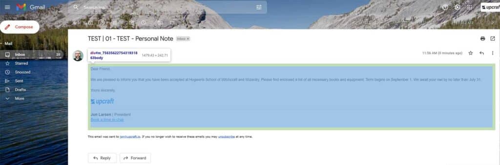
1) “Personal Note”
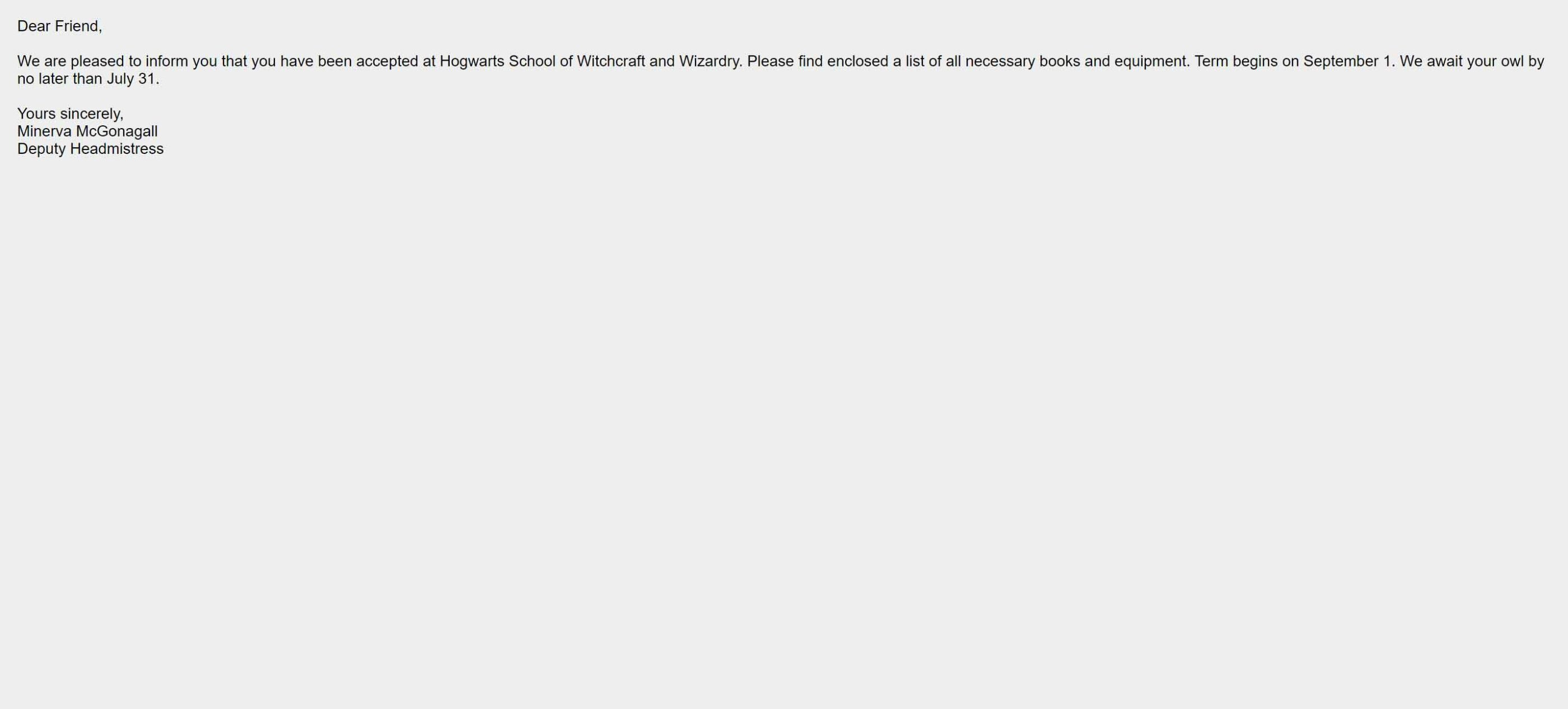
This email template is literally a single editable text area with zero modules, variables, etc. Bonus points for the nerdy Harry Potter reference!

Editor functionality: No modules or variables.
Render Testing: No issues. It’s hard to break plain text.
Our Thoughts: Sometimes you just need a plain-text email template, particularly for Sales or Operational emails. This template works fine. With a little HTML copying and pasting, you can add your email signature as well to maintain consistency with email sent from your Gmail or Outlook account. The one issue we ran into was 10px of unnecessary padding that is hardcoded into the template…
Ideally, we’d remove that in order to keep consistency between mail sent 1-to-1 from email accounts and email sent via this Marketo email template.
2) “Skeleton”
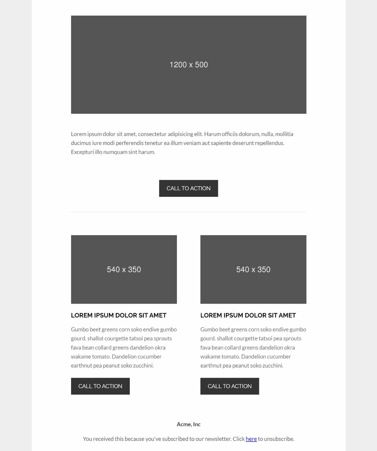
This is a fairly simple email template with a 1 column section, a 2 column section, and a footer. The design and aesthetic is clean and very basic.
Render Testing: No issues.
Our Thoughts: “Skeleton” is Marketo’s take on a basic, no-frills email template that can be easily branded. (See our take here!) It’s a decent start toward a flexible “master” email template, but there are some notable features missing such as global font variables, toggles to show/hide components, and alignment variables. Also, there is no Logo module (this alone makes this template practically unusable), and the image module is locked at 600px wide.
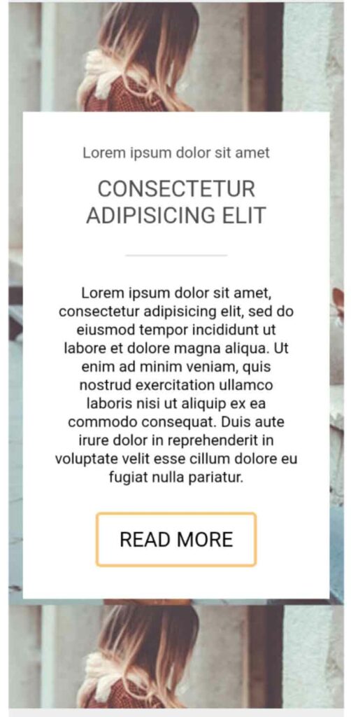
3) Glossy
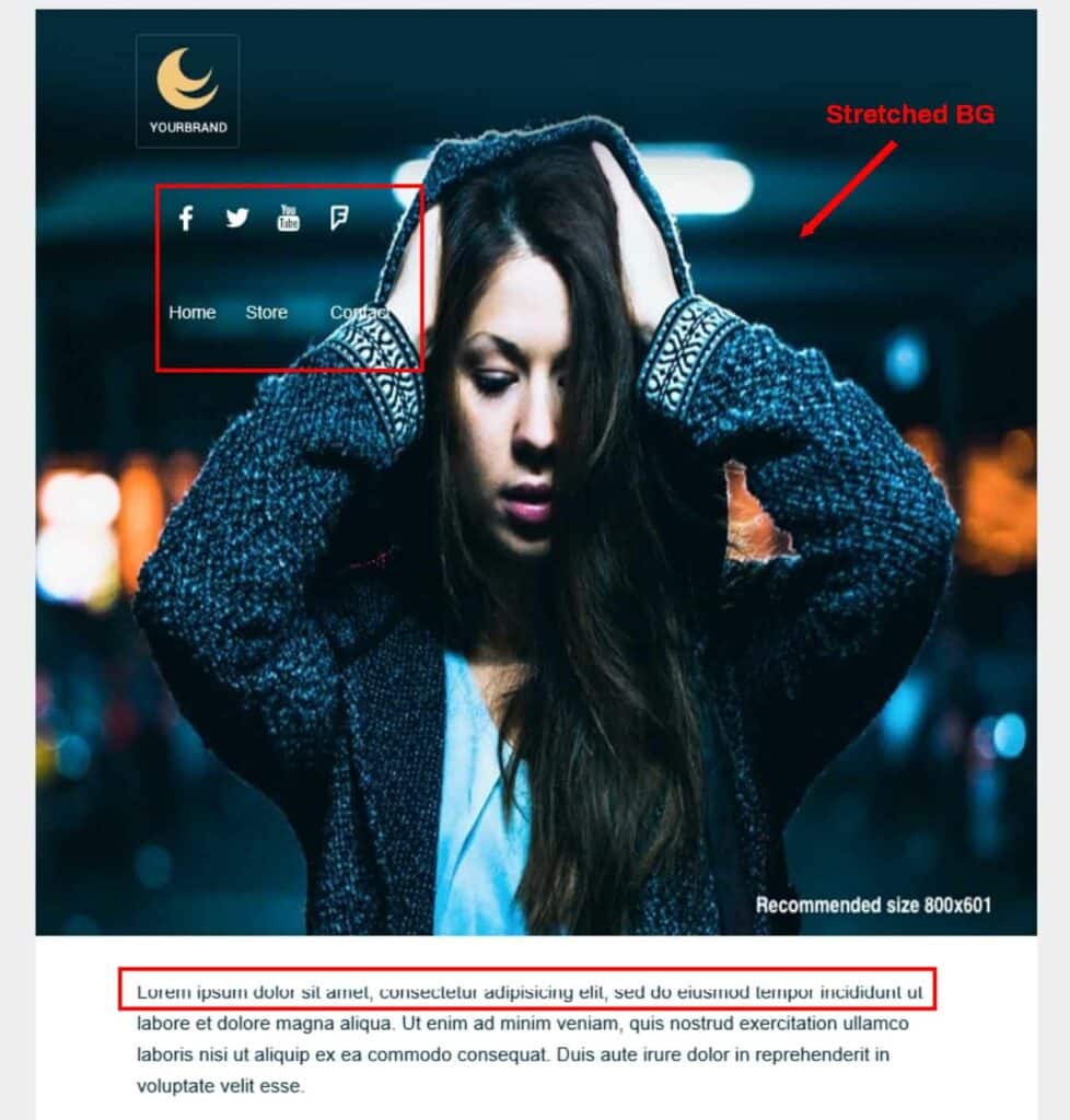
“Glossy” is the 1st in a set of 4 e-commerce email templates. This one features an image-heavy design that is a bit more complex and custom than some of the others.
Render Testing: The background images look nice on desktop, but there is no way to adjust image height on mobile which makes for one tall header section that pushes everything WAY below the fold…
Also, be aware that awkward cropping/tiling on mobile is virtually impossible to avoid. Here’s an example…
Then there’s Outlook which has a number of issues. Here are a few…
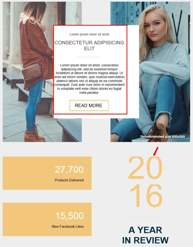
Our Thoughts: “Glossy” has a nice aesthetic design, but there is a lack of features that would make it more flexible such as toggling of individual elements. The footer and header navigation look nice, but currently you can’t add or remove navigation items if you have a different number of sections or sub-sections.
Ultimately, this template will work well as a one-off, but will prove frustrating if used as a master email template. On top of that, if you have a significant mobile or Outlook audience, the rendering issues might be a deal breaker.
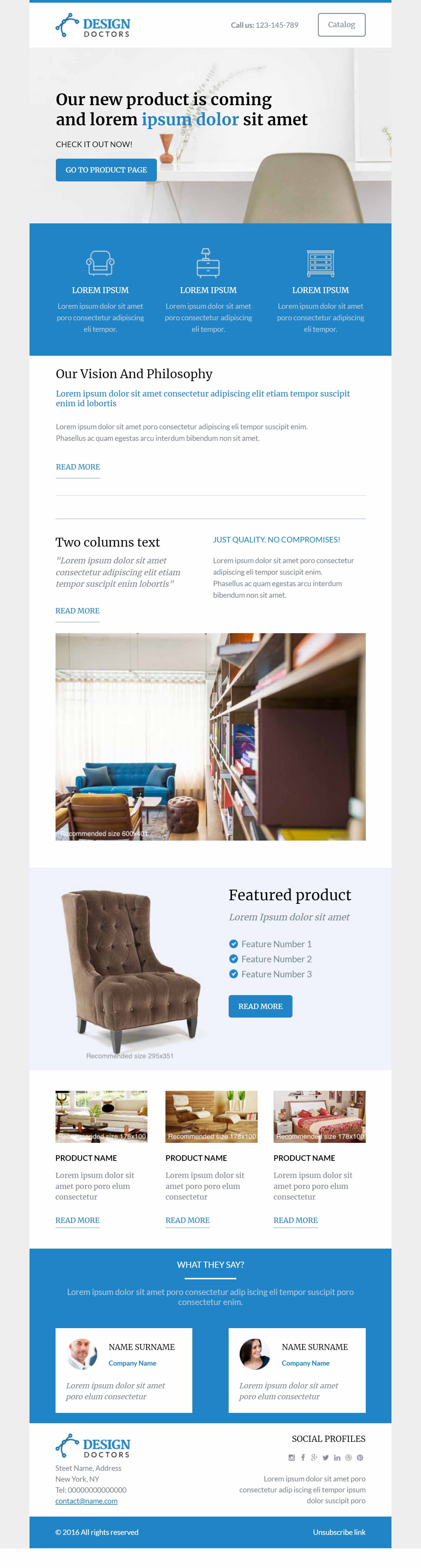
4) “Homegrown”
“Homegrown” is a clean, flexible template with enough variety in its modules to make it a contender for a “master” email template. While configured as an e-commerce template, with a few minor concessions you could repurpose this for standard B2B use-cases.
Render Testing: One minor issue in Outlook 120dpi, but mostly clean besides that.
Our Thoughts: With a few more features like global font variables, toggles to show/hide components, and alignment variables, this could be a decent master email template. There are some workarounds though… for example, you can “Clear contents” of a section to hide it, but this will leave some slight vertical space that you’ll have to account for.
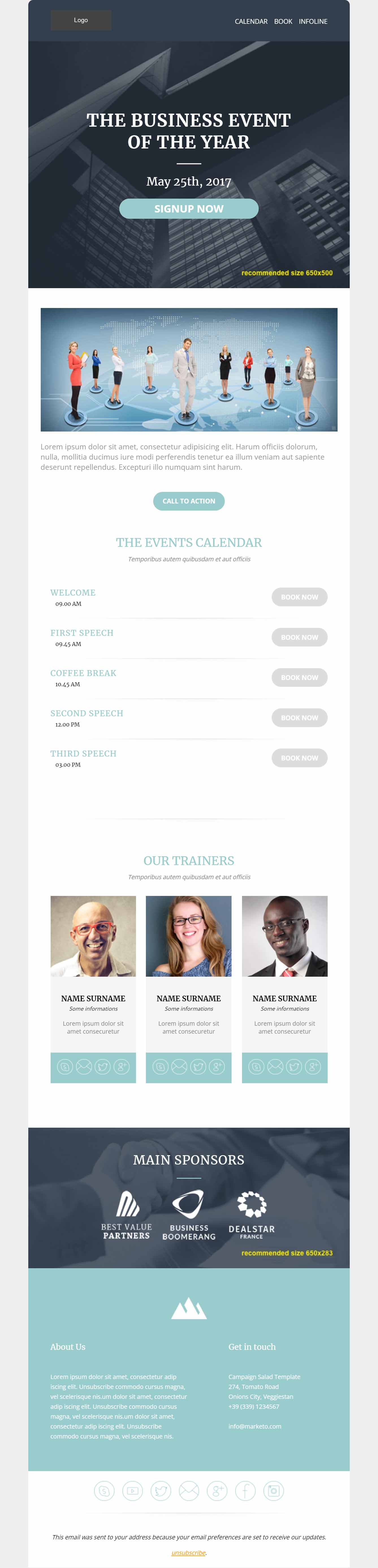
5) “Private Jet”
Similarly to “Homegrown” above, “Private Jet” has potential as a semi-flexible email template for a variety of B2C and B2B use cases.
Render Testing: One minor issue in Outlook 120dpi, but mostly clean besides that.
Our Thoughts: As with “Homegrown,” this template needs more features like global font variables, toggles to show/hide components, and alignment variables.
6) “Urbanista”
“Urbanista” is an e-commerce email template with some nice aesthetic elements. It’s not incredibly flexible as I’ll describe below.
Render Testing: Outlook had a few spacing and alignment issues such as the following…
Our Thoughts: The Logo bar is a bit awkward with hard-coded rounded corners that look out of place next to gray a background. There is a Background module with no option to add text on top, which begs the question why isn’t this just a simple Image module instead? Buttons are hard-coded and can’t be removed, plus the alignment isn’t consistent. Finally, the social module has 7 hard-coded icons with no option to hide any that aren’t needed. I think the only way to make this template usable would be to make some one-off HTML updates via the “Edit Code” workaround referenced at the top of this article.
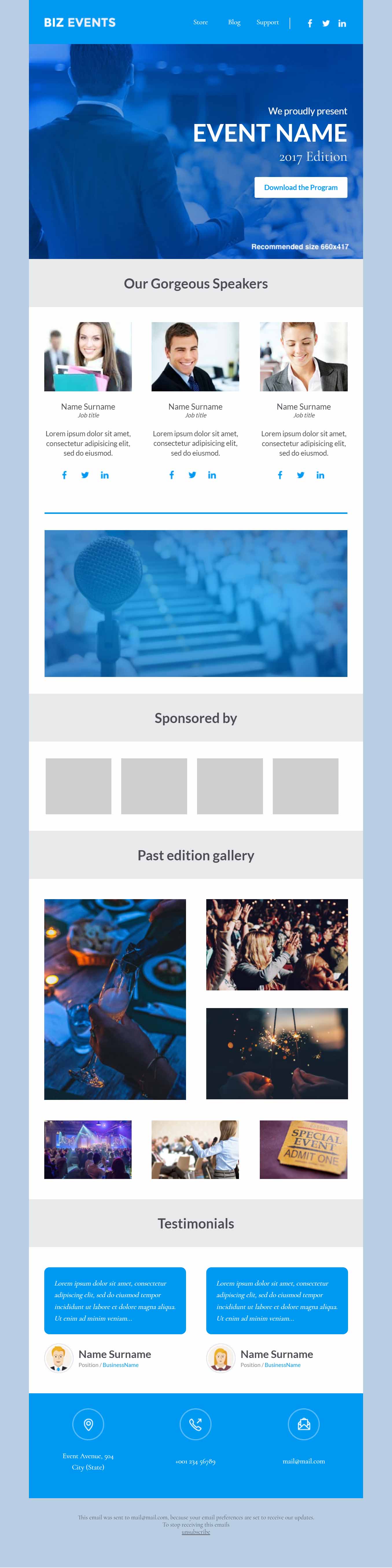
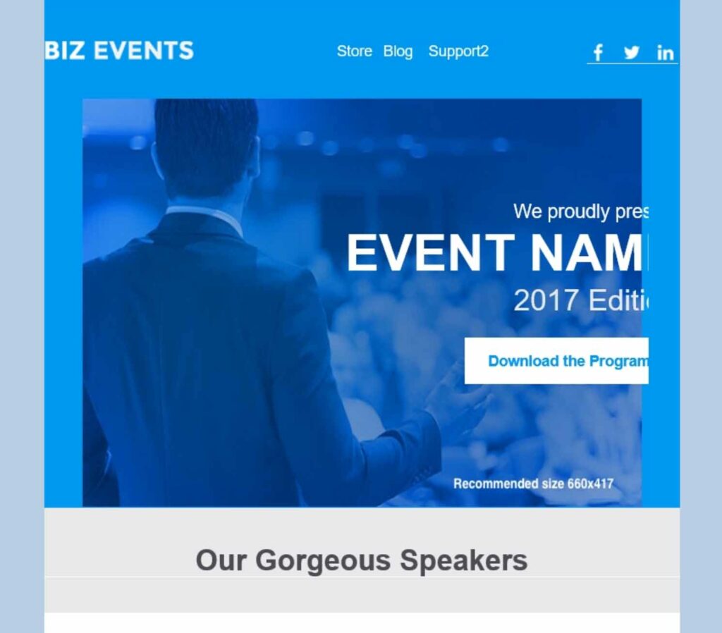
7) “Carnival”
“Carnival” is the first of six starter event templates. The design is clean, modern, and should more than cover any sort of event email needs.
Render Testing: Lots of Outlook issues.
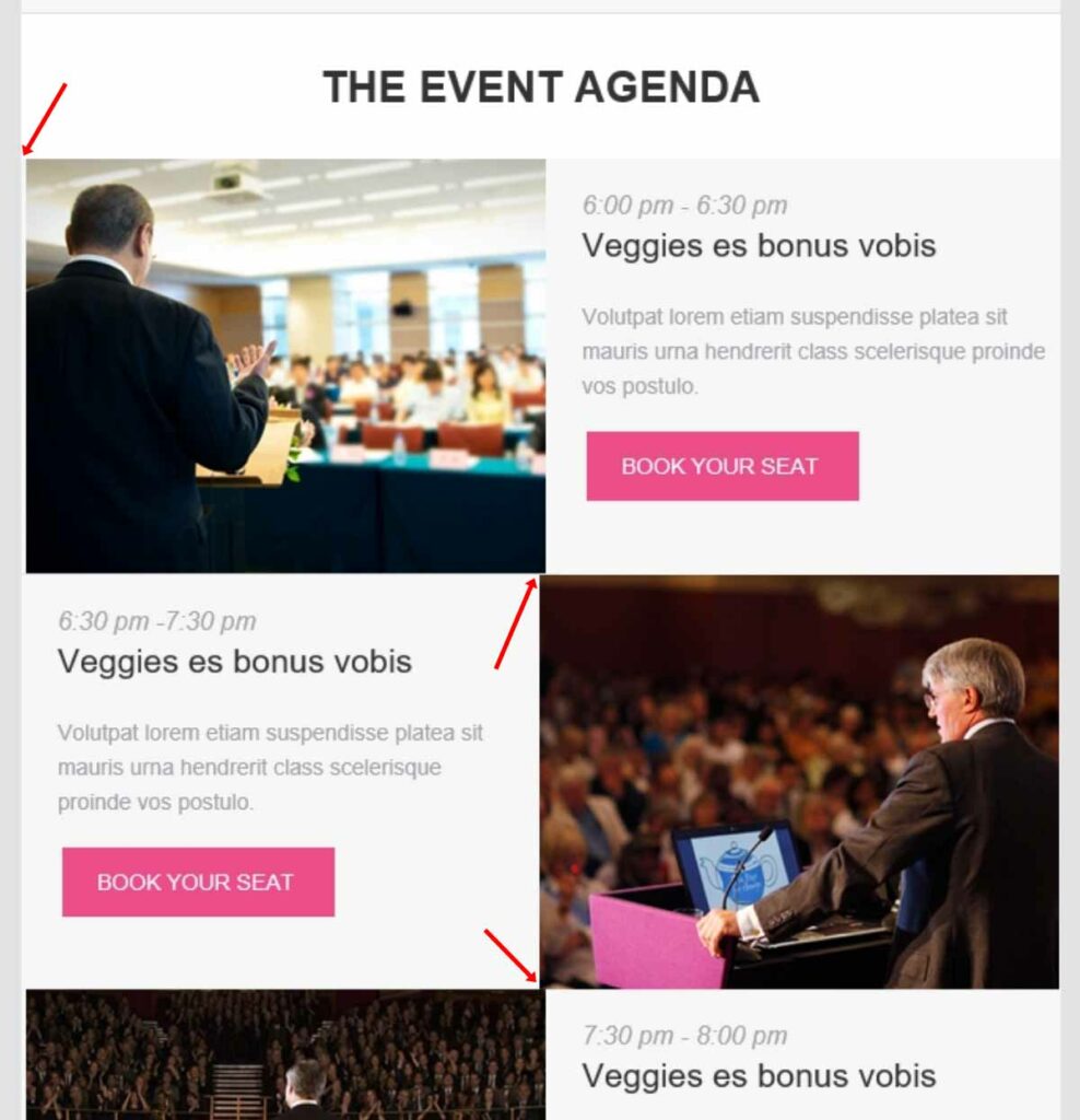
Our Thoughts: The Outlook bugs are enough reason to pass this one up. In addition, the logo module has non-removable CTA button, social icons, and navigation. Most of the other modules have non-removable buttons as well. For example, having an agenda module is nice, but marketers might not have need for “Read More” associated with the agenda specifically.
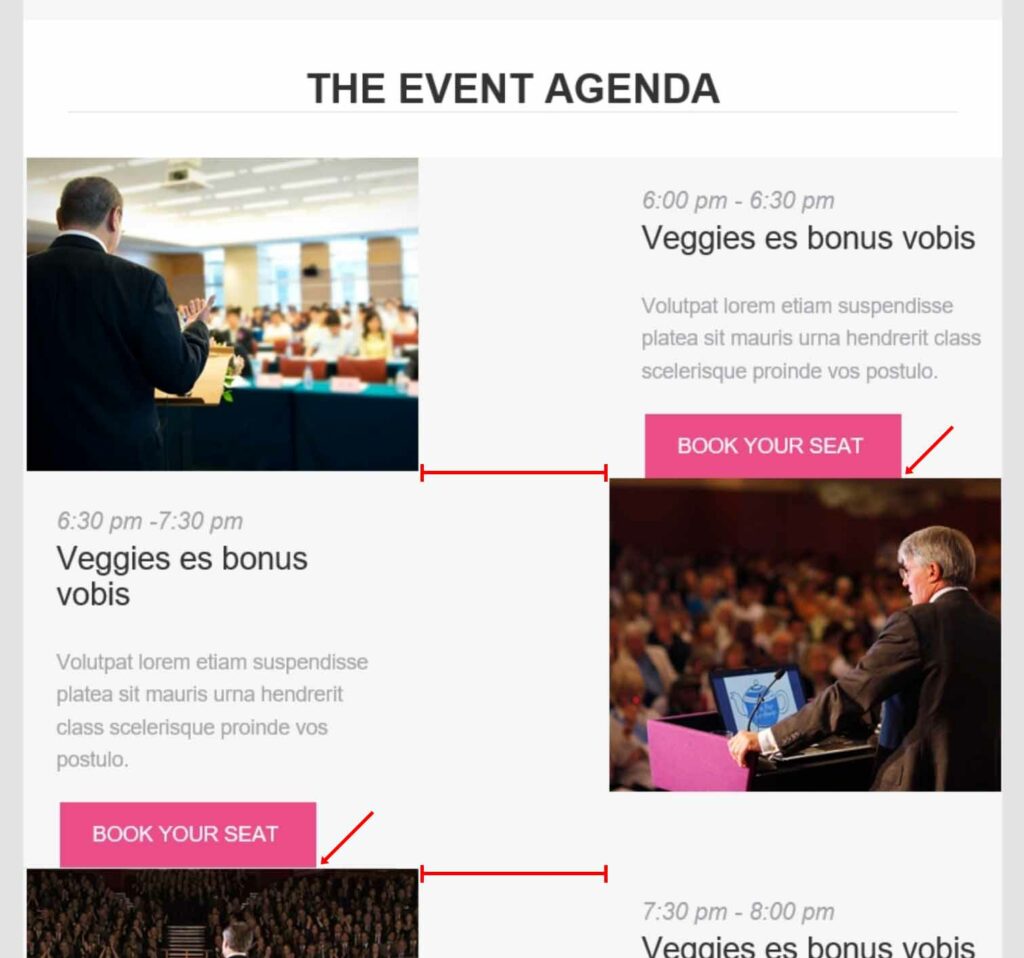
8) “Futurama”
“Futurama” is an event email template with a bit of a generic design and nice agenda layout that would be great if it rendered properly on mobile.
Render Testing: Lots of Outlook bugs similar to previous templates. Additionally, mobile is not scaling correctly for Android.

And the zig-zag agenda looks nice on desktop but gets really messy on iPhone.
Our Thoughts: This might be my least favorite design of the 6 event starter templates in terms of aesthetics. Everything looks a bit dated. There are functional issues as well. Not only is the top navigation non-toggleable, it’s also formatted in a way that line breaks with anything above 4 characters of text. Finally, a slew of render issues on mobile and Outlook make “Futurama” a bit less forward thinking than it’s name suggests.
9) “Get Ready”
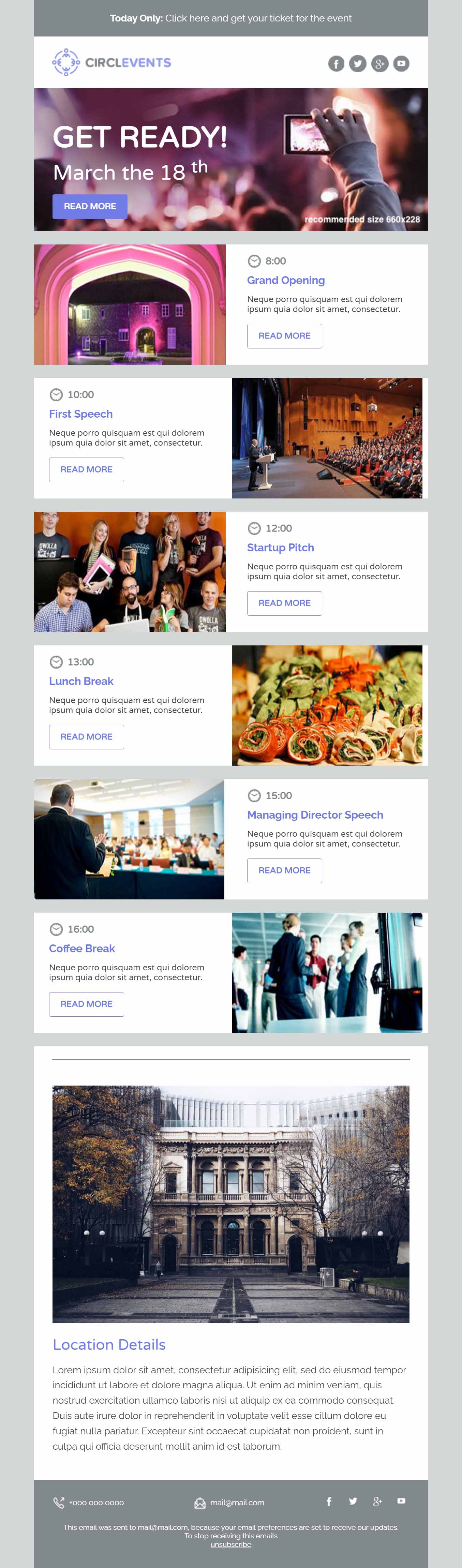
“Get Ready” delivers a bold agenda-based layout with alternating left and right columns.
Render Testing: We found issues on mobile, Outlook, and Gmail. See below.
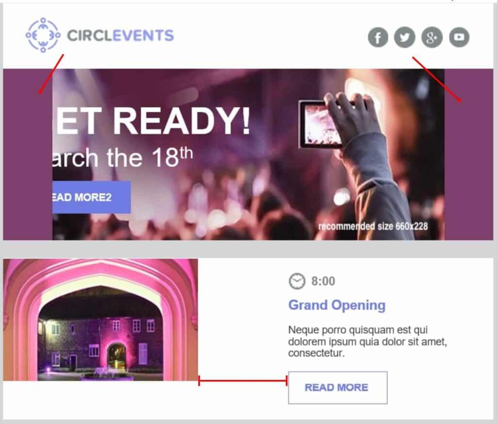

Our Thoughts: This template is missing a lot of basic content modules and a dedicated CTA button. The biggest issue, however, is that the purple subhead text is hardcoded. So if you absolutely love the look of this template and are still developing your org’s branding… go with purple, maybe?
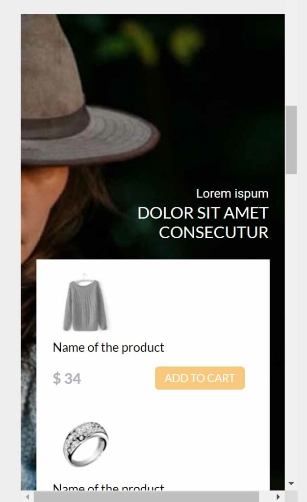
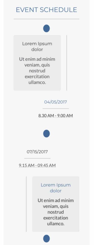
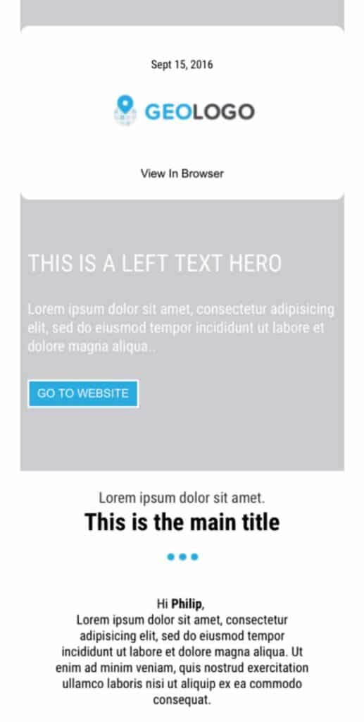
10) “Iceberg”
“Iceberg” has a clean B2B look and feel along with some impressive-looking agenda, speaker, and sponsor modules. Let’s see if the functionality and render testing measure up!
Render Testing: Looks good across all email clients!
Our Thoughts: As is the case with several others, this starter template doesn’t offer much flexibility in terms of hiding unneeded components. The speaker module requires 3 speakers, and the sponsor module requires 3 sponsors. Ultimately, what sets “Iceberg” apart from many of the others in this set of templates is it’s clean B2B aesthetic and lack of rendering issues.
11) “Limon”
While “Limon” is categorized as an Event template, it doesn’t have any modules specific to events such as agenda, speakers, etc. It could probably work as a decent newsletter or general purpose email.
Render Testing: No major issues!
Our Thoughts: If you can get over (or remove via Edit Code) the unnecessary hardcoded button in the logo bar, this is a simple, semi-flexible email template worth trying out.
12) “Showtime”
“Showtime” is another event template option, but this time there is no text module for event details. The photo gallery module is a nice touch, but ultimately nothing particularly stands out about this template.
Editor Functionality: The navigation in logo bar cannot be removed, and there is some awkward coding as 1 nav item is an editable area and the other 2 nav items are local variables.
When updating the logo, be aware that 2x logos aren’t supported due to the way this is coded, so you’ll have to stick to a 72dpi 1x logo.
Render Testing: A few issues on Mobile and Outlook 120dpi.

Our Thoughts: We recommend you pass on this email template as their are too many functional and render bugs. “Limon” and “Iceberg” are better options for event emails.
13) “All Aboard”
“All Aboard” is a relatively clean and simple template which is the first in a set of 8 newsletter email templates. It contains modules for header, call to action, single post, and double post.
Render Testing: Everything renders cleanly except for the following Outlook 120dpi quirk.
Our Thoughts: This is a decent newsletter template worth trying out. As with pretty most of these templates, cross your fingers and hope that your logo dimensions will work with the width that is hard-coded into the logo bar.
14) “Basic”
While “Basic” is categorized as a newsletter email template, I believe this is actually more of a product email.
Render Testing: Everything looks clean in Litmus. While not a deal-breaker, the images in the feature section really should be centered on mobile instead of left aligned.
Our Thoughts: If you need a product email for a software app, this seems to be the primary use-case. The look and feel are somewhat forgettable, but at least the top navigation is in it’s own module and thus removable if unneeded.
15) “Breaking News”
“Breaking News” seems to have plenty of flexibility and options well-suited for a newsletter email template. It has various post modules as well as some basic headline, button, and separator modules.
Render Testing: No major issues found.
Our Thoughts: While this newsletter email template looks nice and has some variety in terms of the modules, there are a couple drawbacks that will prevent this template from being incredibly useful. First of all, there are some hard-coded orange elements that can’t be changed via variables (e.g. button border color is editable, but the button text color is not). Secondly, as with many of these starter email templates, it’s all or nothing with the social icons.
16) “Brooklyn”
“Brooklyn” has some interesting design characteristics, but there are definitely some drawbacks in terms of flexibility. In particular, the logo, social icons, two CTA buttons, headline, and subheadline are all part of the same top module without any option to remove unused elements. And we would prefer a standard footer with editable text instead of the call and email icons.
Render Testing: We found a few issues with Mobile and Outlook.
Our Thoughts: This template has a lot of extra elements baked into it, which is a problem given the inability to hide/show these elements. It’s not a bad design though, if you care to invest some resources into updating the HTML.
17) “Flatiron”
“Flatiron” is a newsletter email template with a similar look and feel to “FYI.” It looks a bit dated in terms of aesthetic design elements, and the spacing just feels a bit odd right out of the box.
Render Testing: None of the rounded corners are going to work on Outlook, plus the header module has some issues similar to what we’ve seen with previous templates…
Also, on mobile, there isn’t anything particularly broken, but you’ll notice that the background image has been disabled on mobile… plus the spacing just feels a bit awkward.
Our Thoughts: There are plenty of other email templates in this starter set that look better and have fewer bugs.
18) “FYI”
“FYI” is categorized as a newsletter email template, but this is really just a glorified plain-text email for sales and customer comms. It’s missing a footer module, but probably ok for it’s intended plain-text purposes.
Render Testing: No major issues found.
Our Thoughts: Nothing too exciting here. If you need a plain-text email, you might just consider “Personal Note,” “Skeleton,” or “Limon.”
19) “Snowbunny”
“Snowbunny” is another newsletter design with a sports theme. However, once you swap out the imagery, this is a pretty general template that could work for B2B purposes. It has a unique design for it’s 3 post and 1 post module using bordered boxes.
Render Testing: No major issues.
Our Thoughts: This template is relatively flexible, and you might find it to be a decent option for newsletters. One item you’ll need to be aware of is that some of the green text is hard-coded, but you should be able to override this within the WYSIWYG editor.
20) “Sophia”
“Sophia” is a minimalist newsletter design featuring a lot of photography. The main limitations we found are that the logo and header are combined into one module. Also, like several other templates, the buttons are really only meant to be bordered as it’s impossible to change the black button text color.
Render Testing: On Outlook, the background image tiles at the bottom. It’s not terrible, but still an issue. Also, be aware that the background image on mobile won’t be centered so plan your imagery accordingly.
Our Thoughts: This is a fairly decent template, but the lack of a dedicated logo module holds it back from being very useful. And as with all 30 of these starter templates, you’ll have to settle for a 1x logo as the image sizing tools are disabled in the template code.
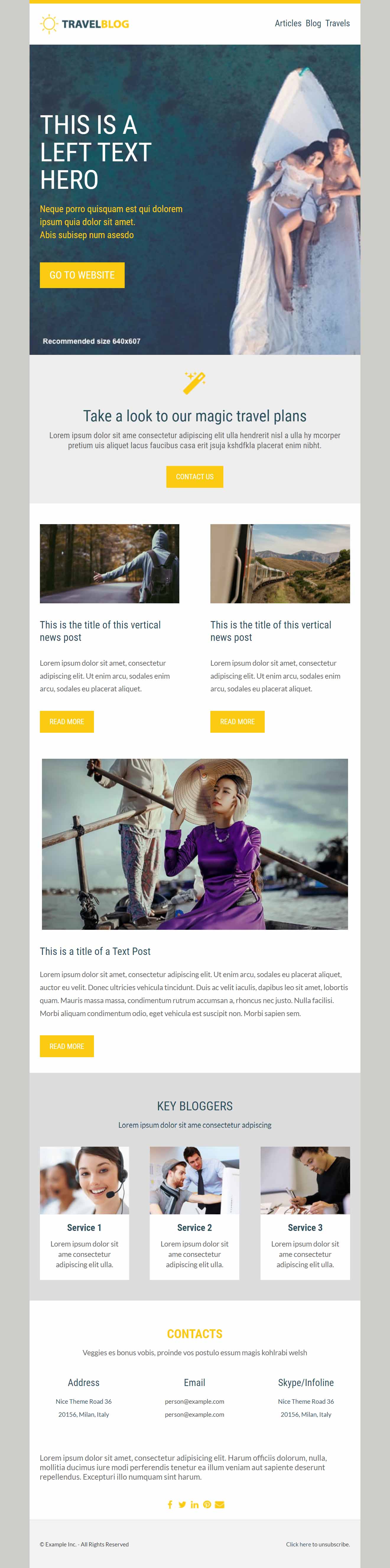
21) “1000 Miles”
“1000 Miles” initially looks like an e-commerce use-case, but I could see the creative 2-column layouts working well with a B2B SaaS product feature email.
Render Testing: While not a render bug, on mobile the CTA button lands below the fold. You’ll want to consider removing the Free Text and Nav modules to bring the content up into the initial view. Also, as shown multiple times in previous template, Outlook 2019 (120dpi) cuts off the header text on the left.
Our Thoughts: This template look fairly attractive, and the use of background imagery behind cascading 2-column modules is a nice touch to a product feature email use case. However, one final gotcha is that the logo is hardcoded to 600px wide, so you’ll have to clone the template code and fix that.
22) “Maverick”
“Maverick” is a product email template with a lot of interesting sections built into it. It’s missing a logo module at the top, so you’ll likely have to clone the code and add this module to the HTML.
Render Testing: Some issues on mobile. See below.
Our Thoughts: Without a logo module, I don’t recommend using this template unless you know how to clone the template code and add that functionality back in.
23) “Mission Control”
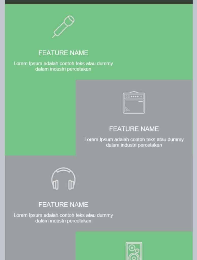
“Mission Control” looks fine if not a little bit dated. The concept behind this email template is to lay out different features and selling points of a product. The layout is highly specific and require the use of darker background colors and imagery in order to make the hard-coded white text areas show up.
Render Testing: Mostly fine except for some serious Outlook 120dpi bugs.
Our Thoughts: This design is an interesting approach, but it ultimately lacks flexibility and has rendering issues.
24) “Serenity”
“Serenity” has a decent look and feel that could work for B2B or B2C. The modules could work for products, features, or potentially blog articles.
Render Testing: Outlook 120dpi has a variety of padding issues.
Our Thoughts: This template is flexible and nice looking, and is worth trying out as long as you don’t have a lot of Outlook users in your audience.
25) “Smooth Sailing”
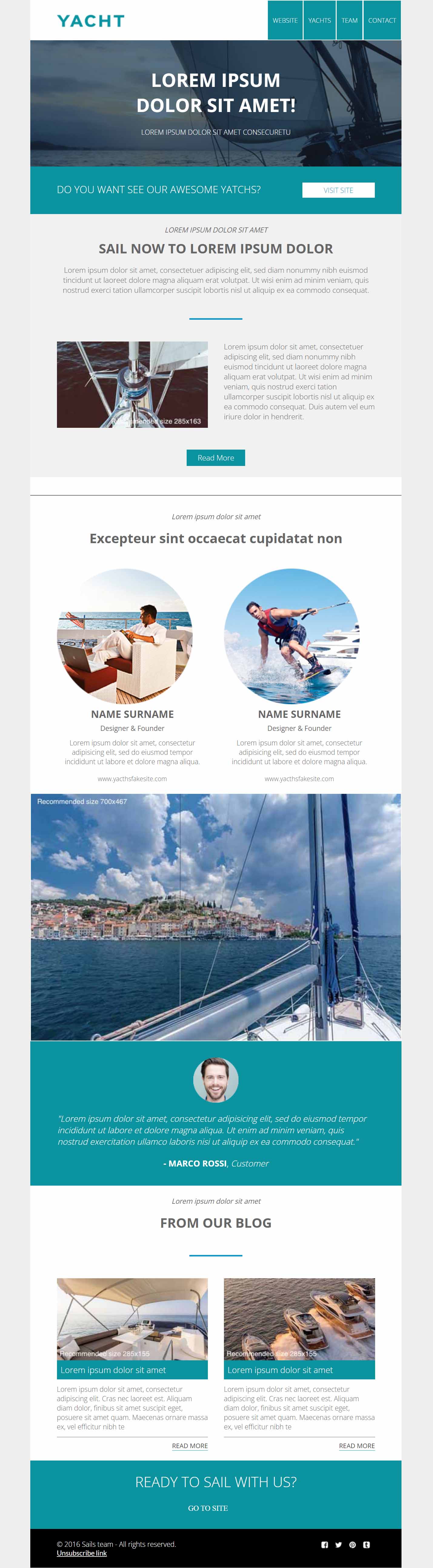
“Smooth Sailing” has a pretty dated look to it. It could make a decent intro/welcome email, but it ultimately lacks the type of modules most marketers expect.
Render Testing: All the typical Outlook bugs are present here, unfortunately.
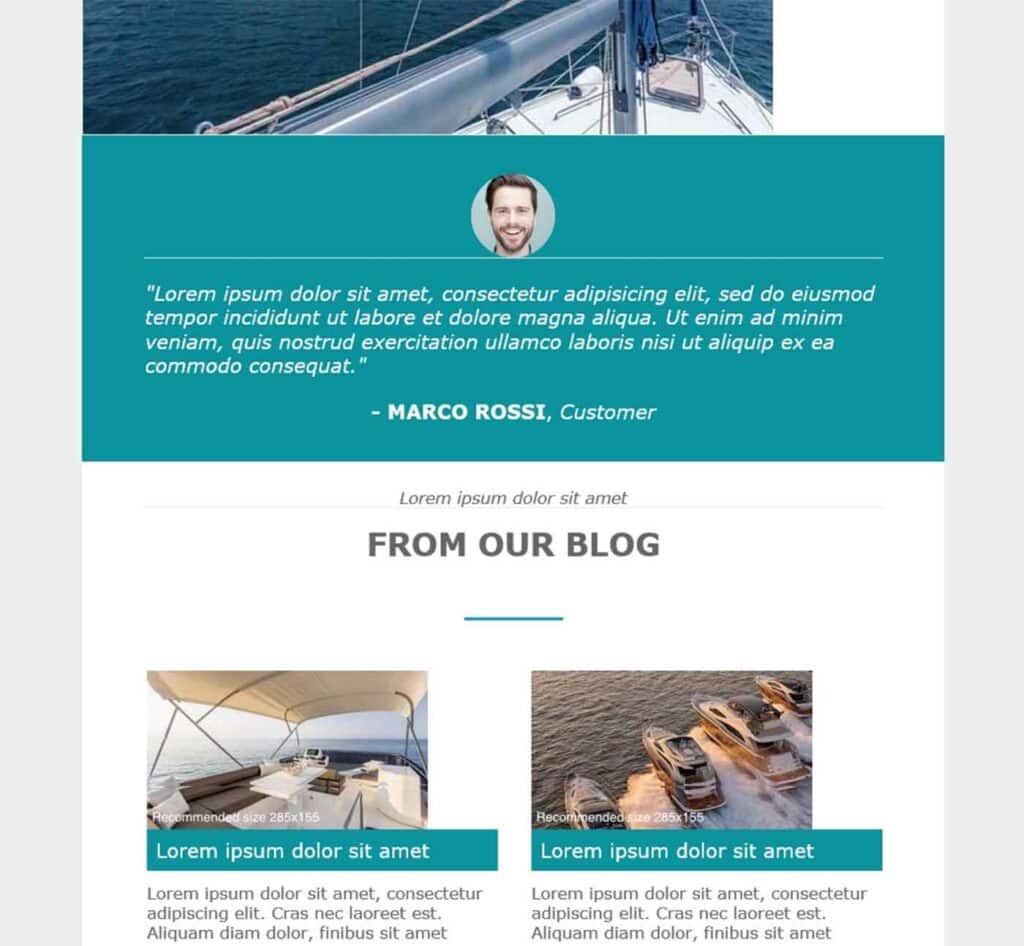
Our Thoughts: I’ll be honest… I don’t really get “Smooth Sailing.” The header looks like it was built more like a web page than an email. If you can get past the bugs, you’re still stuck with a layout that doesn’t take advantage of current email best practices.
26) “Good News”
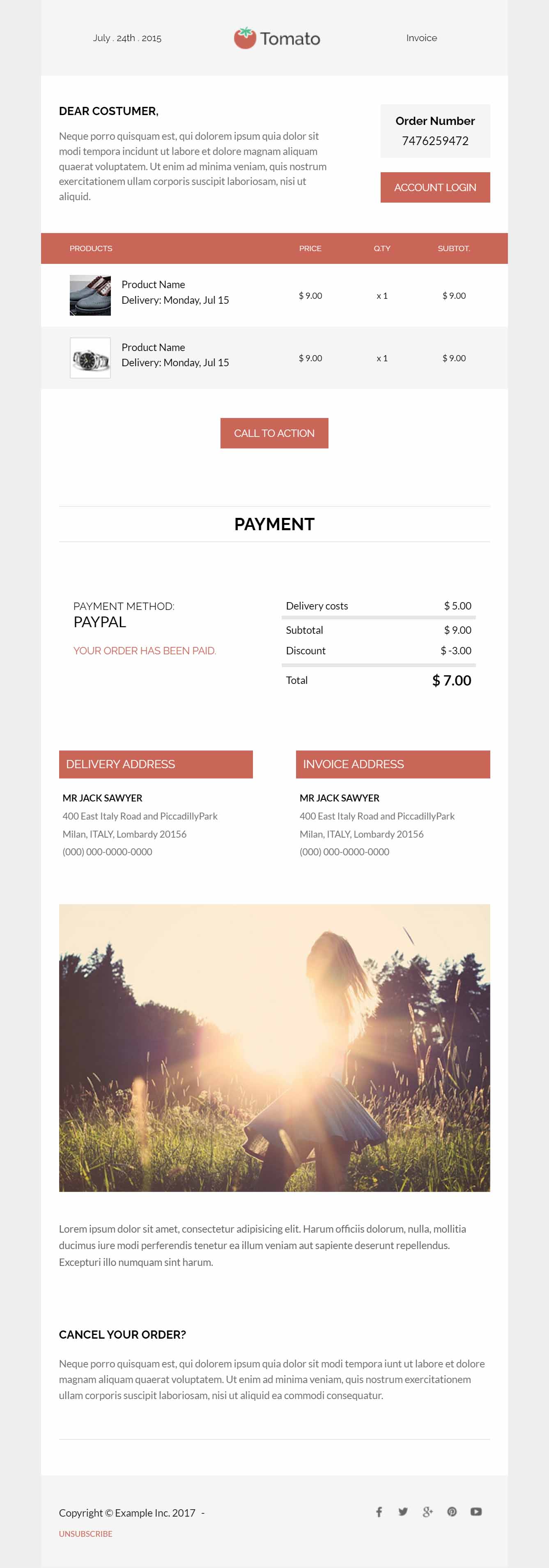
“Good News” is a relatively clean and simple order receipt email. Except for the logo module which has the notorious omission of show/hide variables, the rest of the template is usable.
Render Testing: No issues!
Our Thoughts: This template might be a good starting point for a receipt email. But in that case, there’s a good chance you might be relying on Velocity Scripting to display the order table. This would make the current order table functionality (which relies on editable areas) useless. You’d have to rework the module code to accommodate Velocity Scripting.
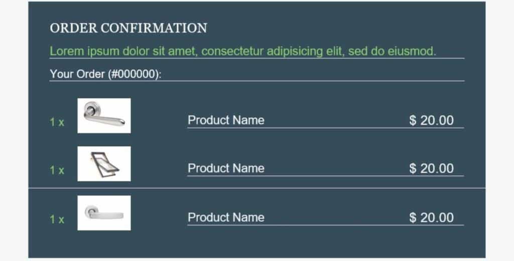
27) “Home Improvement”
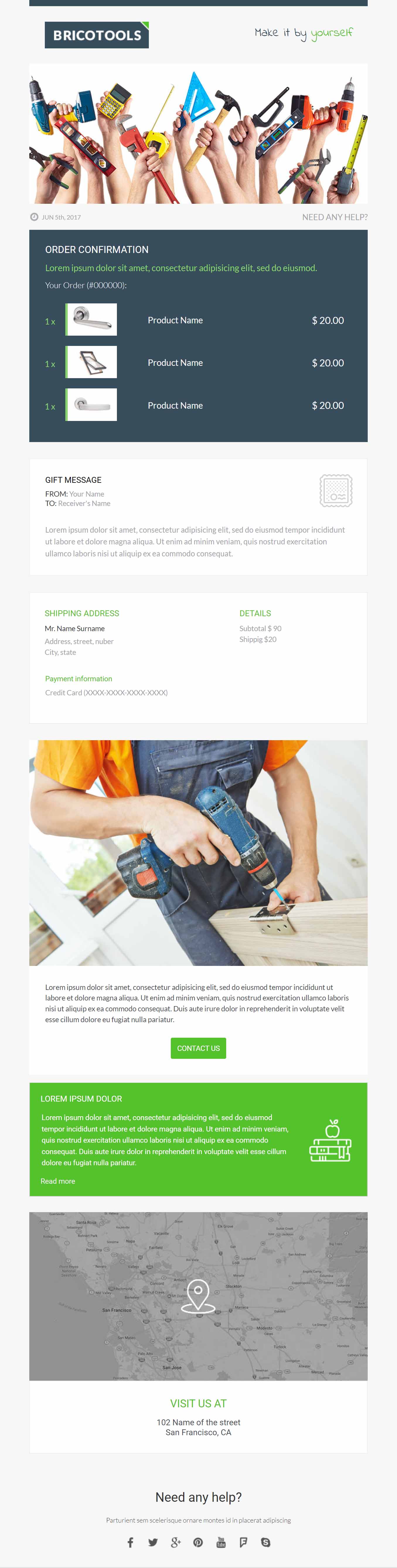
“Home Improvement” has a lot of similarities to the previous transactional starter template. The design of this one looks a bit more marketing focused and not quite as transaction.
Render Testing: Outlook 120 showed those buggy horizontal lines on the order table, which pretty unfortunate for an email where that table is a primary focal point.
Our Thoughts: For reasons stated in the previous “Good News” template, I recommend staying away from this template if you plan on using the order receipt table. Either way, their are Outlook bugs throughout.
28) “Save My Spot”

“Save My Spot” plays it safe with a very basic layout with a lot of whitespace. As a result, there are fewer things that can go wrong technically, and this template holds up just fine for general email use cases.
Render Testing: No issues!
Our Thoughts: Thankfully there are no extra, unnecessary text areas added to the logo module. Other than that, you should give this email template a try as it’s quite flexible due to each line of text being a separate module that you can clone, move, or delete.
29) “Short and Sweet”
“Short and Sweet” is really basic with 4 simple modules. Not much to get excited about aesthetically either.
Render Testing: All good!
Our Thoughts: Nothing terrible here. But that 1 pixel horizontal separator line reminds me of Outlook 120dpi line bugs, which is a pet peeve of mine. The previous template (“Save the Spot”) is a better pick if you want a simple, bare-bones email template.
30) “Slam Dunk”
We’ll end on a “Slam Dunk” at least according to the team who put these templates together many years ago. I’m getting strong 2012 affiliate marketing vibes with this one. An option to ditch the mini nav plus adding a basic footer would be helpful.
Render Testing: No issues!
Our Thoughts: Not to sound too snarky, but this one could be called “Missed Layup.”
Final Thoughts and Impressions
I know that these are free templates, so the expectations are a bit low. Please excuse my occasional snarkiness in the above reviews. I mean no disrespect to Marketo or any of the devs involved in these free starter templates. The reality is that not all email templates will stand the test of time, as best practices evolve and refine over time along with rendering standards across email clients. With that said, there are some decent little gems in this set if you’re in a pinch and don’t have a budget for something more robust and modern.
Other Email Templates to Consider
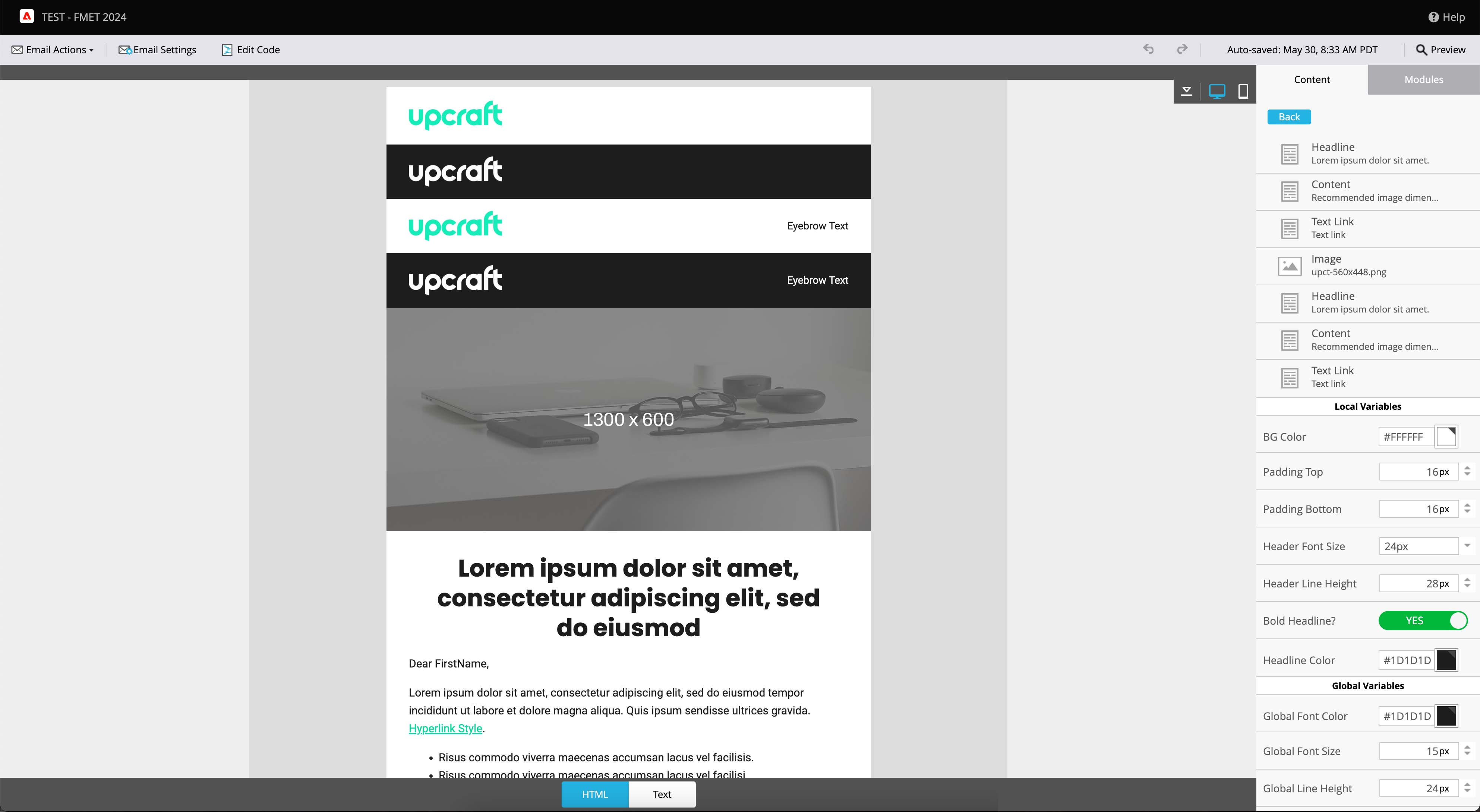
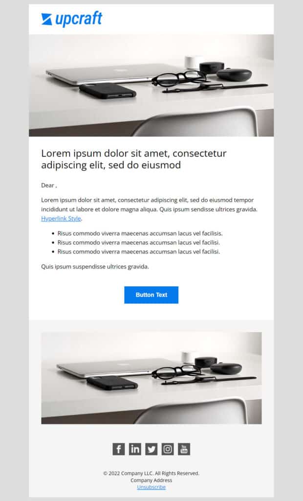
Upcraft offers a free modular Marketo email template that is flexible and easy to customize. This is the multi-purpose, basic starter template we always wanted. Check it out!
Upcraft also has a premium master Marketo email template with 29+ modules that cover infinite use-cases. This is our flagship template product, and we think you’ll love it!
Another free resource is this pack of 6 free Marketo email templates from Jenna Molby. These email templates don’t make use of modules, but they are still decent starting points if you wanted to code something more custom from it.
For all things related to Marketo email templates including best practices, email technology trends, etc., check out upcraft.io and follow our LinkedIn page.